| |
Polish sugar packets - Different text or its position
(Packets presented here are from my collection and are not for exchange.)
 |
|
Sometimes two packets seem to be the same, but they actually differ with a detail or two. Below are such pairs (or threes) of packets which you could tell the same at the first look, but they are different, in fact.
|
|
Sometimes sugar packets differ slightly in the text that is printed on them
|
|
Take a look at the lists of cities on these Lavazza pieces - that's the only difference in each row below.
|
|
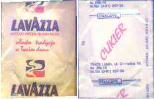
Differences on the front side: the ® sign and the text at the bottom. More differences in the text on the back.
|
|
Different font used for "netto 4 g" (or "Masa netto 4 g" in case of POL-109), and a bit different background in each case. Also, a minor, easy-to-overlook, difference in the text on the back.
|
|
The text on the back side is different. Besides, the packets differ slightly in size.
|
|
POL-625.


Other categories for this packet:
Wemapak
|
POL-678.
Other categories for this packet:
Wemapak
|
|
POL-130.
Other categories for this packet:
Wemapak
|
POL-910.
Other categories for this packet:
Wemapak
|
|
Check the position of the 'TM' mark after I'm lovin' it
|
|
The difference is in the size of the restaurant logo and in the color of the print (blue/gray)
|
|
POL-545.
Other categories for this packet:
Mokate
|
POL-862.
Other categories for this packet:
Mokate
|
|